One Chatsworth
Interior Styling; Design, Reno & Build; Duplex Condo; 2020
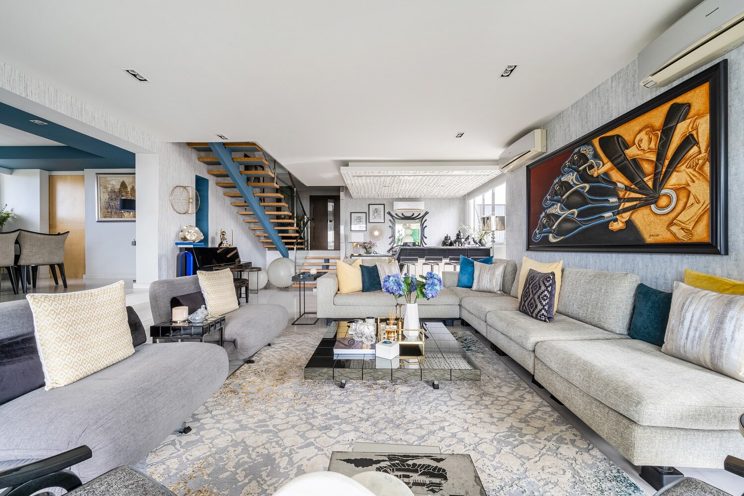
An upcoming party spurred the family of this home to spruce up their space. In the first part of this project, we completed minor renovation and styling of the living room, dining room, entryway, family room, and outdoors. Part two is currently underway with more extensive renovation required.
The focus of part one of the project was to turn the home into a warm and inviting space suitable for entertaining. The family had an extensive art collection and had been living in their home for a while, but found their existing decor cold and dated.
Please scroll to the bottom for project notes.
Bar
The bar was previously clad in black and white. Although the client was ready to demolish it, we felt the feature was both functional and had the potential to anchor the living space.
Instead, we re-laminated the cabinet doors to reduce the overuse of the heavy black tones. Adding wallpaper helped to balance the visual weight of the bar counter while opening up the space.
Entryway
In the entryway, we redid the cabinetry of the shoe cabinet, creating a graphic statement with mixed laminates.
A graphic mirror and wallpaper helped to balance the floor-to-ceiling storage doors and set up the visual language of the apartment.
Dining
Working with existing pieces, we upped the drama with a new pendant lamp and a simple round mirror in similar glass and black tones.
Family Room
The accent blue paint extends from the entryway through the dining room and family room, creating a warm and cohesive look in this eclectic home.
Textures, colours and abstract patterns helped to increase the visual depth of the space.
Outdoors
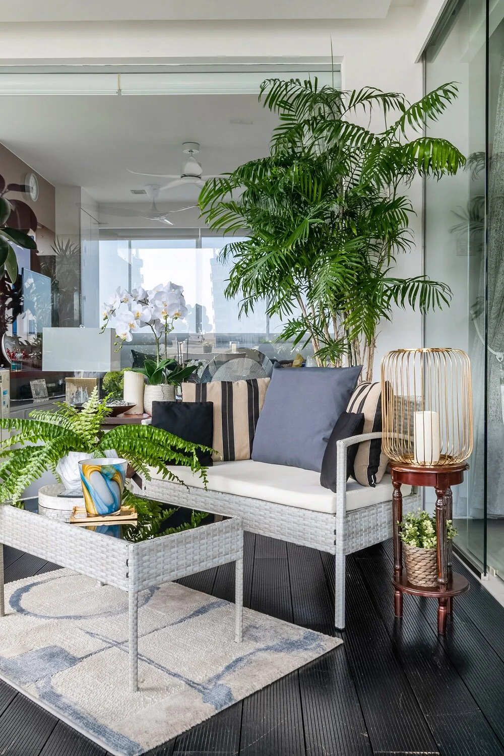
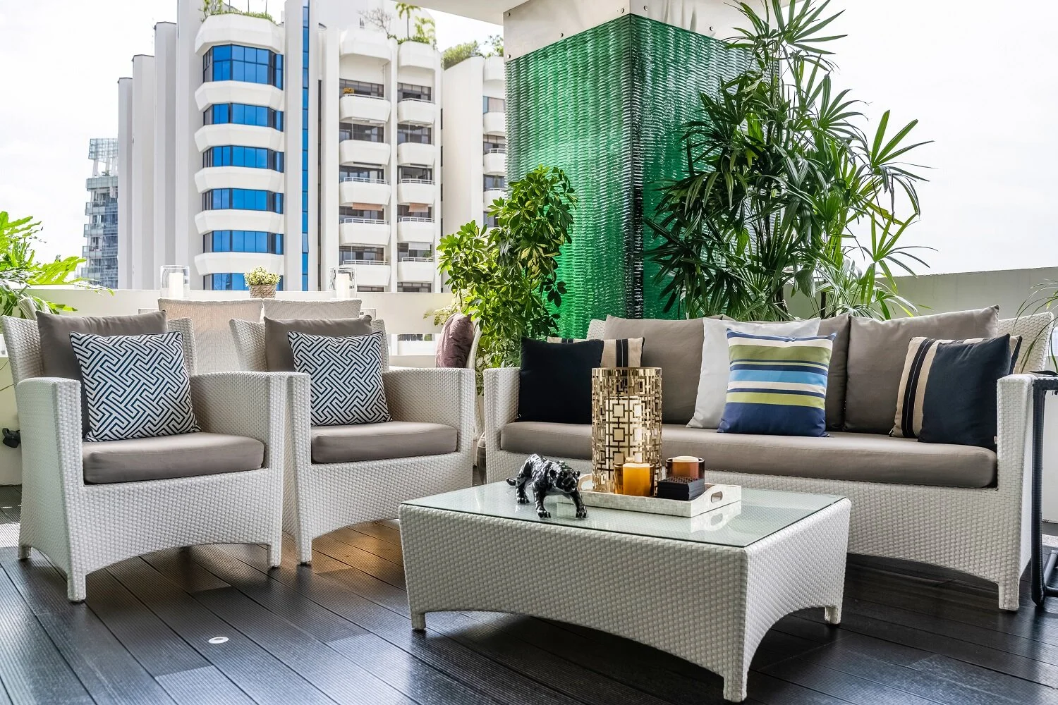
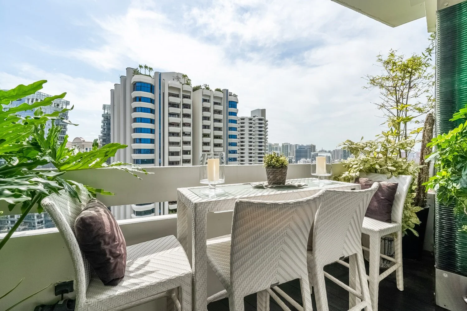
We learned the family uses their outdoors extensively and organises viewing parties to watch cricket games on a projector outdoors.
We reconfigured the existing seating and bar sets to allow for an additional lounge set that can be used for both entertaining and everyday enjoyment. The new layout, coupled with additional decor, helped facilitate a seamless indoor/outdoor flow.
Notes from our stylists
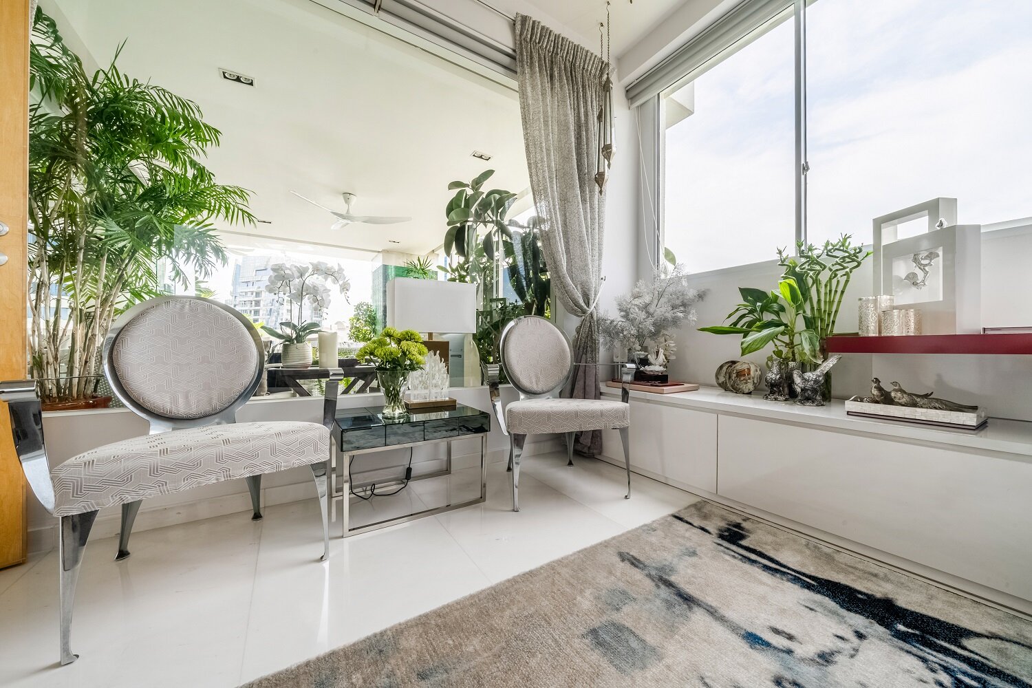
We retained most of the family’s furniture but optimised for space by reconfiguring the layout of some areas and moving around key pieces of furniture. We also reupholstered the family’s armchairs.
The addition of wall treatments was key to warming up the space. In addition to using an accent blue paint in certain areas (stairway, ceiling of the dining and family rooms), we used textured wallpaper in the entryway and living room for a subtle yet high-impact visual statement.


